
How to Choose Surface Pattern Designs That Ensure Brand Alignment
- Jo Phillips

- Sep 8, 2025
- 3 min read
Updated: Sep 16, 2025
With so many beautiful surface pattern designs out there, choosing the right one for your product can feel like a minefield. Whether you’re preparing for a seasonal launch or simply want to refresh your current collection, your pattern choices should do more than just look good - they should feel like you.
That’s where brand alignment comes in. When a pattern reflects your visual identity, resonates with your customer, and enhances your product’s appeal, everything clicks into place. It's no longer just a design: it becomes a tool for connection, consistency, and growth.
And the good news? You don’t have to navigate that decision alone.

Why Brand Alignment in Surface Pattern Design Matters
Your brand isn’t just your logo or your colour palette. It’s the personality behind your business: the mood, the feeling, the experience someone gets when they come across your products. Pattern design is one of the most powerful tools you can use to visually communicate that identity.
Here’s why alignment really matters:
1. Consistency Builds Recognition and Trust
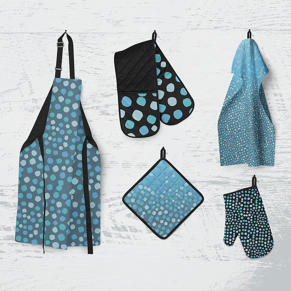
When your patterns complement your existing visuals and tone, they help build a cohesive product story. That consistency not only reinforces your brand but also helps customers instantly recognise your work - whether it’s on packaging, textiles, stationery or homeware.
2. Designs Create Emotional Connection
The right pattern can do more than catch someone’s eye. It can speak to their values and feelings. If your brand is grounded in nature, calmness, or sustainability, a pattern that reflects those things will instantly feel more meaningful to your audience.
3. Pattern Design Supports Brand Growth
When your visual identity is well defined, patterns can be used intentionally across a growing range of products; supporting seasonal ranges, collaborations, and licensing opportunities while maintaining a recognisable, unified feel.
How to Choose the Right Pattern for Your Product-Based Brand
It’s easy to get swept up in trends or pick a design simply because it’s beautiful... but for long-term success, strategy is just as important as style.
Here are four things I always consider when helping clients select (or create) the right surface pattern designs:
Know Your Aesthetic
Are you modern and minimal? Bold and playful? Soft and organic? Your aesthetic is the foundation for choosing patterns that feel true to your brand. Without this clarity, your product range can feel disjointed or confusing to customers.
Understand Your Audience
Think about who you're designing for. Do they love subtle, timeless pieces or vibrant, trend-led prints? Do they value sustainability, storytelling, or function? Patterns should serve your customer as much as they serve your brand.
Consider Colour Psychology
Colour plays a huge role in how your products are perceived. While your core brand palette matters, understanding the emotional impact of colours can help you choose or adapt patterns that evoke the right response from your audience.
Think About Product Application
Scale, repetition, and composition are critical here. What looks amazing on a notebook might overwhelm on a cushion. A seamless repeat that feels balanced and commercial will always outperform a pretty design that’s hard to apply. (This is also where the tools matter - more on that in my Why Adobe blog, which covers precise pattern repeats and swatch creation in more detail.)

Tips for Finding the Right Surface Pattern Designer
When we work together, I don’t just send over a bunch of designs and hope something sticks. My process is collaborative, thoughtful, and tailored to your brand vision.
I’ll ask questions about your business, audience, and goals. I’ll explore what’s working well visually, and where things could be strengthened. From there, I’ll either recommend licensing-ready designs from my collection or create something custom that brings your ideas to life.

Whether you’re a buyer, art director, or product-based business owner, my goal is the same: to help you find (or design) the perfect pattern that aligns with your brand and elevates your product line.
Let’s Create a Pattern That Speaks Your Brand Language
Looking for a custom surface pattern design or want to license a pattern collection that strengthens your brand?
I’d love to explore how we can create something thoughtful, commercial, and unmistakably you.
Book a video call to start the conversation.


Comments